Back to blogs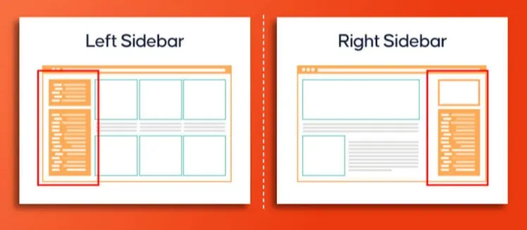
How to Create a Sticky Left and Right Sidebar with a Scrollable Center Section (HTML, CSS, and Tailwind JSX Example)
March 28, 2025
3 min read
Creating a Layout with Sticky Sidebars and a Scrollable Center Section
In this guide, we’ll go over how to create a layout with sticky left and right sidebars while keeping the center section scrollable. This type of layout is commonly used in dashboards, blogs, and other web applications where sidebars need to stay fixed while users scroll through the main content.
Key Features
- Sticky Sidebars: The left and right sidebars remain fixed even as you scroll.
- Scrollable Center Section: The main content area allows users to scroll independently.
- Responsive Design: Built with Tailwind CSS to ensure it adapts to different screen sizes.
HTML & CSS Example
<!DOCTYPE html>
<html lang="en">
<head>
<meta charset="UTF-8">
<meta name="viewport" content="width=device-width, initial-scale=1.0">
<title>Sticky Sidebar Layout</title>
<style>
body, html {
margin: 0;
padding: 0;
height: 100%;
}
.container {
display: flex;
height: 100vh;
}
.sidebar-left,
.sidebar-right {
position: sticky;
top: 0;
height: 100vh;
width: 200px;
background: #333;
color: white;
padding: 20px;
box-sizing: border-box;
}
.center-content {
flex-grow: 1;
overflow-y: auto;
padding: 20px;
background: #f4f4f4;
height: 100vh;
}
</style>
</head>
<body>
<div class="container">
<div class="sidebar-left">Left Sidebar</div>
<div class="center-content">
<h1>Main Content</h1>
<p>Scroll down to see the sticky effect...</p>
</div>
<div class="sidebar-right">Right Sidebar</div>
</div>
</body>
</html>
JSX with Tailwind CSS
If you’re working with React, Tailwind CSS makes it easy to create the same layout with minimal styling.
import React from "react";
const StickyLayout = () => {
return (
<div className="flex h-screen">
<div className="sticky top-0 w-64 h-screen bg-gray-800 text-white p-4">
Left Sidebar
</div>
<div className="flex-grow overflow-y-auto bg-gray-100 p-4">
<h1>Main Content</h1>
<p>Scroll down to see the sticky effect...</p>
</div>
<div className="sticky top-0 w-64 h-screen bg-gray-800 text-white p-4">
Right Sidebar
</div>
</div>
);
};
export default StickyLayout;
Explanation
- Flexbox Layout: The
flexclass arranges the elements in a row, ensuring they sit side by side. - Sticky Sidebars: The
sticky top-0class keeps the sidebars fixed at the top of the viewport. - Scrollable Content: The
overflow-y-autoclass allows the center section to scroll while keeping the sidebars in place.
This layout is simple to implement, fully responsive, and great for dashboards or web apps where fixed navigation is needed.
Sticky Sidebar LayoutScrollable Content SectionResponsive Dashboard UIFlexbox Tailwind LayoutFixed Sidebars with Scrolling Content